A client dashboard that reports signals, not charts
Flat platform exports become one deployed, access-gated dashboard whose front page names the anomalies worth a phone call.
💡 Dotted words are definitions
Underlined terms have plain-English definitions. Hover on desktop, tap on mobile.
✅ Quizzes keep score
Each section ends with a check. Your teacher-agent takes follow-up questions any time.
The dashboard is an HTML product, not a data dump
The middle-of-funnel project in the course is data collection and tracking: UTMs, dashboards, and the connective skills between them 4:36:37. A UTM parameter is a tag appended to a URL so analytics can attribute a visit to a specific campaign or channel 4:36:50. The naive approach most people take is dumping every export into Claude Code and saying "visualize it" — which produces dashboards the speaker calls "absolutely ass to look at" 4:36:50. The fix is to stop treating the dashboard as a data-showcase tool and treat it as a web design project: a modern dashboard is essentially an HTML page 4:37:28. The reference build, a hypothetical agency called Northbeam Digital, tracks total ad spend, sessions, leads, blended CPL, and closed-won deals on one page 4:37:28.
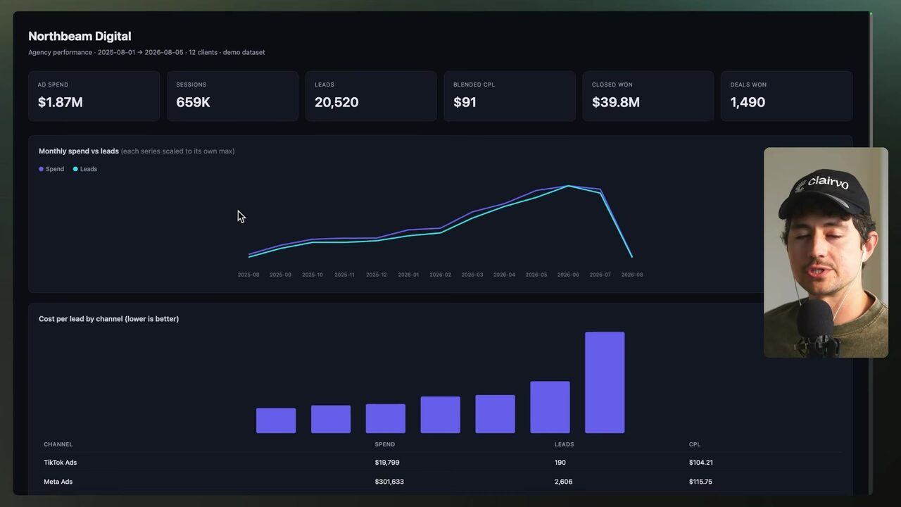
Marketing data lives across Meta ads (spend and clicks), Google Analytics 4, Stripe (revenue), CRM, and email platforms, so a unified dashboard needs an ingestion pipeline — connectors that pull from every platform into one dashboard build 4:37:28. That pipeline runs on a daily, weekly, or monthly schedule to create a single source of truth where all of an organization's metrics live instead of disconnected per-platform reports 4:38:58. The speaker contrasts this with the old agency model, where a monthly "report day" produced polished reports used almost as sales mechanisms; auto-ingesting dynamic dashboards replace that pain 4:38:58. The build flow: read all API docs on the platforms, write the tests and queries, generate a dashboard page, and refresh it with a cloud routine on a schedule 4:40:29. The dashboard also gets an AI assistant so a client can query the data locally on the page 4:40:29.
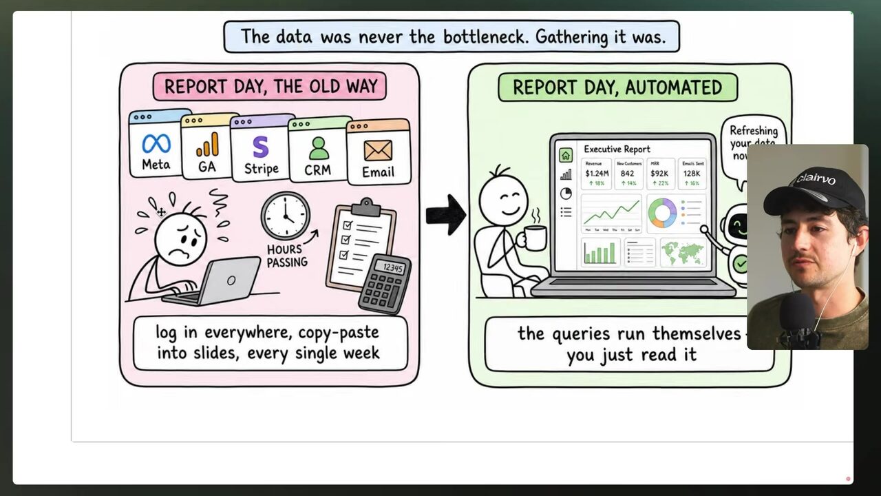
What is the core shift the speaker advocates for client dashboards?
Flat exports stand in for a production database
To avoid exposing proprietary or private real stats, the demo assembles hypothetical Facebook ads, website visits, sales data, salesperson logs, and email stats as fake-data CSVs — CSV being comma-separated values, effectively a Google-Sheet-style flat data file 4:42:01. Step one of the build is assembling all the marketing data files that will stand in for the databases 4:43:32.
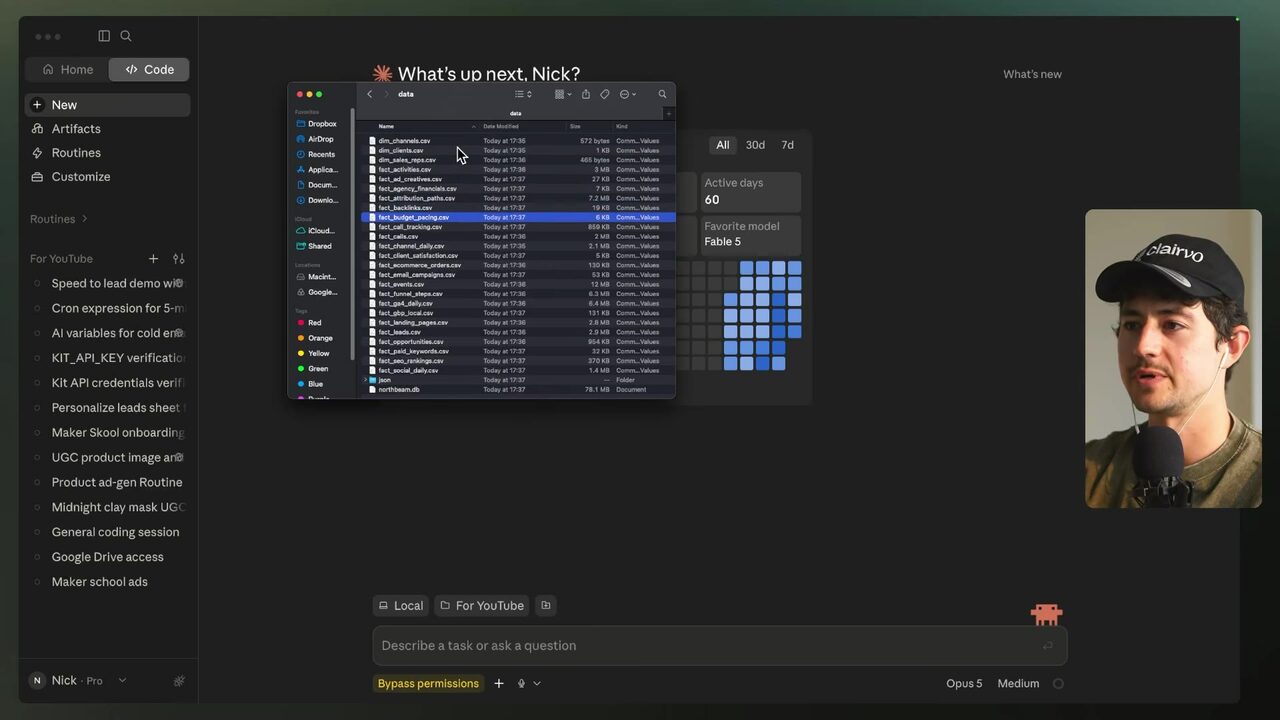
The folder is a mix of dimension tables — channels, clients, sales reps — and fact tables — activities, ad creatives, agency financials, attribution paths, backlinks, budget pacing, call tracking, channel daily, client summaries, and monthly time series 4:43:32. The fact-activities file is a time log of reps' total calls and emails replied, usable for measuring rep productivity 4:44:15. The speaker filters it by activity date, clears all values except rep one, and sums total logged seconds: 2,940 — that is 49 minutes of activity, on the demo's "today" of August 6th 4:44:40 4:45:05. The GA4 file is 6.1 megabits with over 10,000 rows — client ID, channel, country, sessions, engaged sessions, bounce rate, pages per session — while the activity data runs to roughly 50,000 rows 4:45:05.
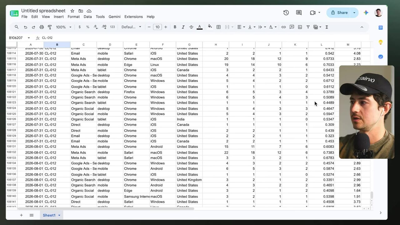
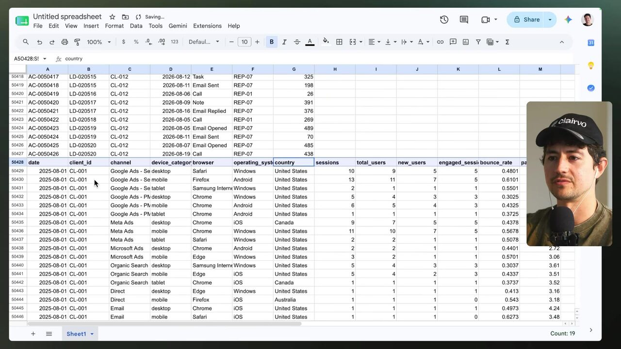
The demo's data folder holds marketing data as flat CSVs. What do the files actually represent?
Let the strongest model find the structure the data forces
The speaker opens Claude Code, attaches the "marketing dashboard data" folder, and feeds it a brief description of all the data plus the folder itself 4:46:36. The prompt asks Claude to go through all the data, find ways to combine the databases logically, create a high-level structure, scaffold pages simply, and provide a few candidate structures 4:46:36.
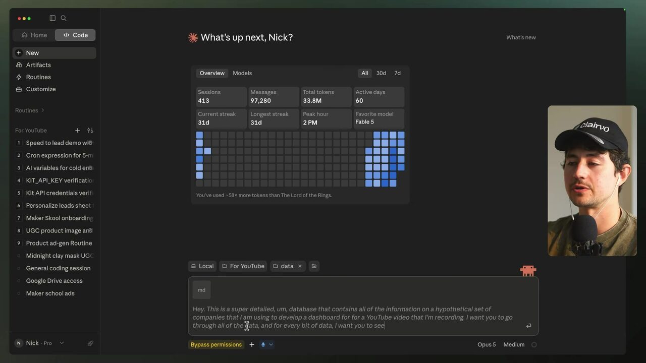
Model intelligence decides how good this analysis gets. Most of the course ran on Sonnet 5, which the speaker calls a "last generation," "not very intelligent" model; for high-quality design he uses the best models available — Opus 5 or Fable 5 — to save time and energy 4:47:30. On a Pro plan he buys a one-time $20 block of usage credits, caps monthly usage at $20, and turns auto-reload off (not needed on Max plans) 4:47:40. Re-running the structure analysis on Fable 5 at high reasoning, he prompts: "I just swapped to Fable 5. I'd like you to revisit these — assume the analysis done before was by a dumber, less capable model" 4:48:07.
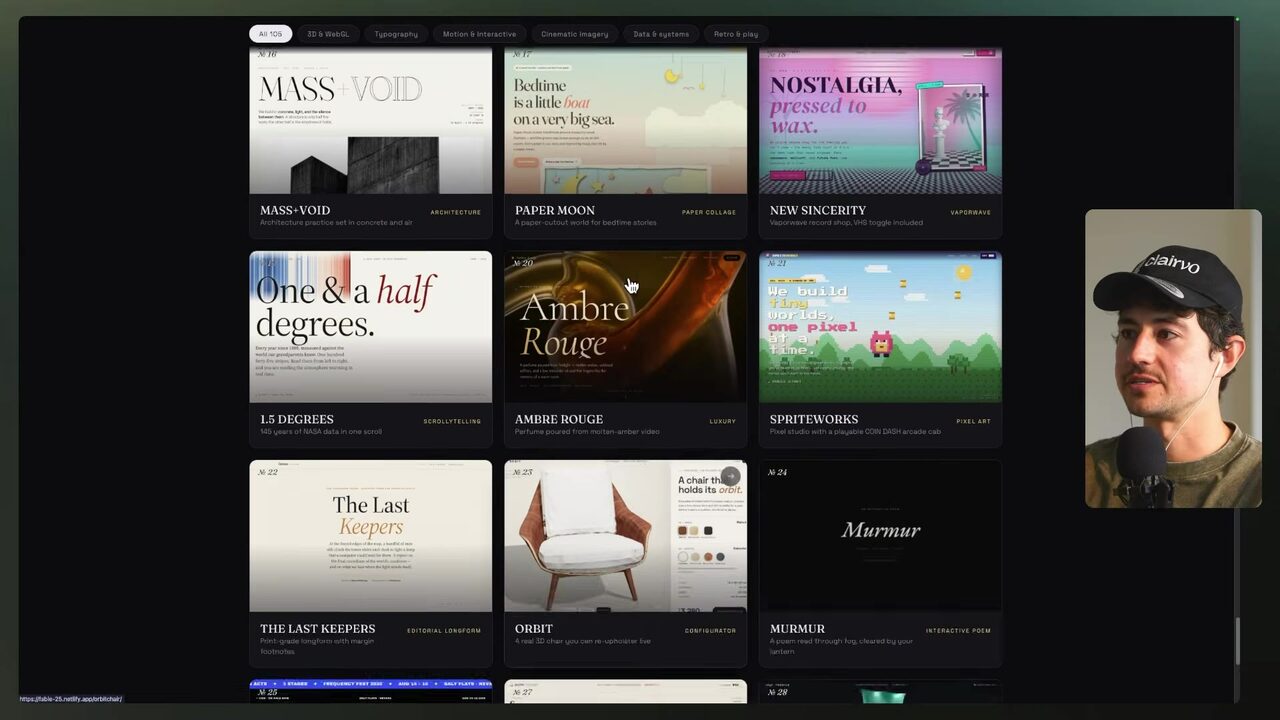
Fable 5 at high reasoning finds three properties of the data that force the structure: the anomaly distribution dictates the primary axis (client-scoped); coverage gaps — e-commerce data exists for only 4 of 12 clients and attribution for only 44% of leads — limit what can be shown; and grain mismatches dictate what cannot be client tabs 4:49:39. The recommended structure: overview, portfolio grid, alert feed, performance, traffic, pipeline, search presence, commercial, client-by-ID, channels, sales teams, and signals 4:49:39. Opus 5 at medium reasoning, by contrast, proposed a funnel-oriented structure (overview, acquisition, traffic and site) versus a client-centric one (agency overview, client detail, channel analysis), plus persona questions like "Are we hitting the number? Where's the money going? Is the site converting?" 4:50:30. The speaker points to "Fable Design 25," a showcase where Fable produced extremely high-quality, well-designed sites — the point being that design need not be constrained when the model is approached in the specific order: first get the data on the page, then "skin" it and select high-quality iterations 4:51:10 4:51:40.
Why does Fable 5 at high reasoning recommend a client-scoped structure (portfolio grid, alert feed, signals) over a funnel structure?
The front page names anomalies, then shows the charts
Threshold detection is simple SQL logic: flag a metric as anomalous when it jumps or collapses faster than a chosen threshold over a period — for example, a ~5x difference 4:52:00. The Fable-5-built Northbeam Digital agency overview puts leads per day beside a client portfolio and active traffic-collapse signals 4:52:15.
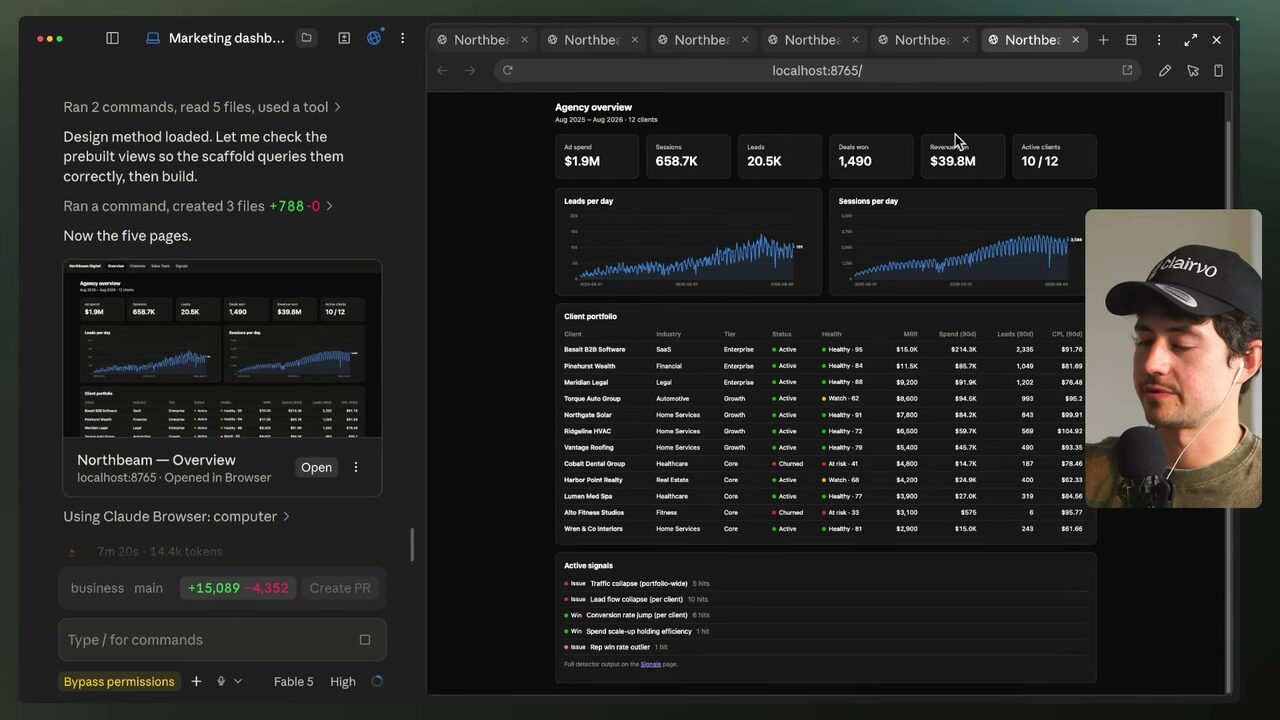
Opening the Signals dashboard names the anomaly outright: a lead-flow collapse for CL-010 in the week of March 9, 2026 — 3 leads versus a typical weekly 57.8 — flagged via that ~5x threshold 4:52:41.
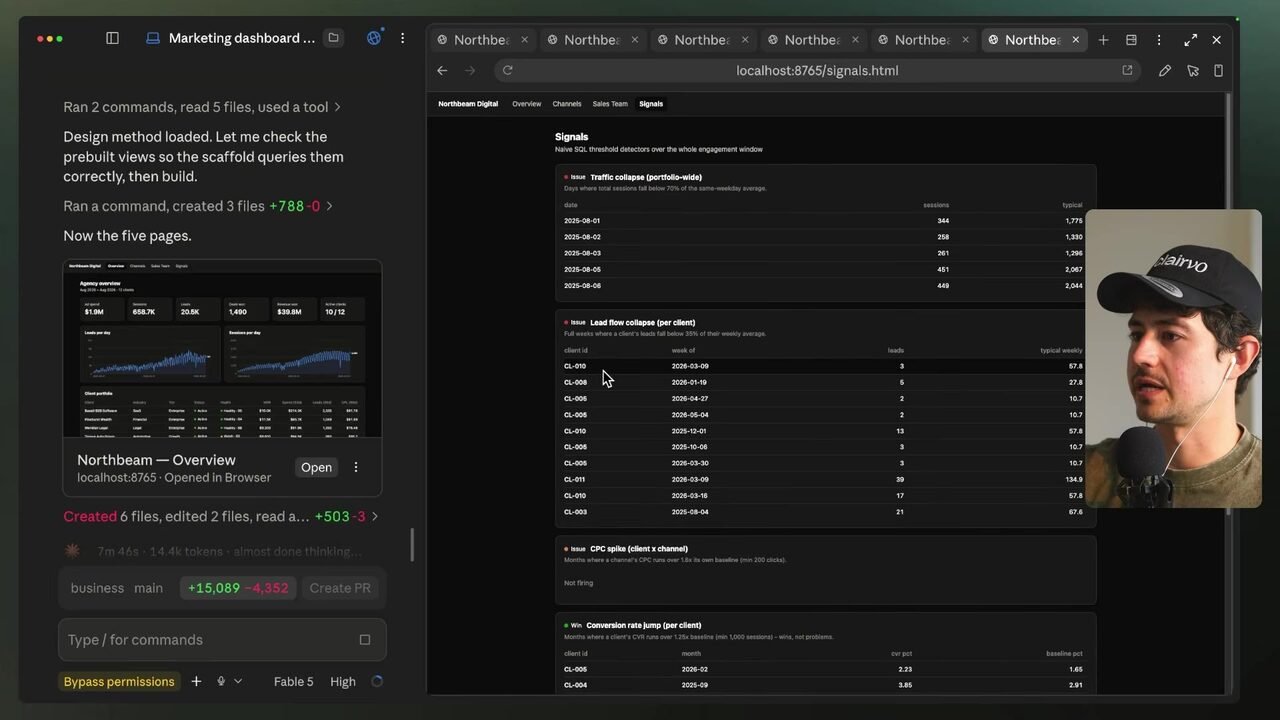
The same logic surfaces a conversion-rate jump for CL-005 — 2.23% against a 1.65% baseline — and a rep win-rate outlier: REP-05 Cole Baxter at 15.6% versus the 24.2% team average 4:53:15 4:53:20. The speaker claims the Fable 5 dashboard session cost about $13 — 94% of the usage limit — for a dashboard controlling ~20 clients and tens of thousands of rows, and the reason to spend it on Fable 5 is to get the scaffold and architecture, then spin it into variants 4:54:12. For an agency, this signal feed is the client-facing proof of monitoring — the reason the dashboard is a retainable product rather than a monthly export.
What does the naive SQL threshold detection flag in the Signals dashboard?
Five agents, one brief: search the solution space in parallel
The speaker switches from Fable 5 to Opus 5 at high reasoning ("extra high" is not available on Opus 5) and asks it to spawn five sub-agents all working on the project simultaneously in HTML, with key focus on interpretability, usability, and practical UX 4:55:43. The math favors parallelization: serial execution of 4 steps at 5 minutes each is 20 minutes; spawning parallel agents on steps 2–5 and merging into a final step 6 takes only ~10 4:57:14. A parallelizable process is one where agents work on the same data resource but their actions are independent and do not impact one another 4:57:40. Pros: much faster, and a broader search of the solution space; cons: more expensive, and because each process must be non-monitored, the risk of failure is higher — acceptable because only one of several variants needs to succeed 4:58:45.
The five subagents each produce a distinct variant — editorial, terminal, Swiss, dense-operations, and warm-print — and the brief requires every variant to find the same seven anomalies 4:59:58. A "bare bones," sleek reference scaffold keeps the structure honest 5:00:22; the background tasks panel shows the main agent "Northbeam" plus the five variant agents, each with transcripts and visible tools 5:01:05. The agents finish at staggered remaining times as the usage limit is approached 5:01:46. The dense-ops variant looks far better in light mode: overview, channels across clients, sales metrics (24.1% team win rate, 1,490 deals won, $39.8M revenue closed), and signals for wins with conversion-rate jumps and losses with traffic collapse; clicking a client exposes performance, traffic, pipeline, rep performance, and search 5:03:18. The terminal-style variant allows drill-down from LinkedIn ads through Google search with filtering and smooth-scroll numbering (1–6) for presentations; the portfolio-style variant shows active/churned/health/MRR on a 30-day timeline 5:04:48. The speaker claims a company making roughly $20–30 million a year took one of these dashboards and put it on office televisions as a slideshow so responsible reps constantly see the metrics 5:03:45.
Why is spawning five parallel sub-agents worth the extra cost for the dashboard design step?
Deploy it, gate it, and let the front page name anomalies
To put the dashboard on the internet, the speaker uses Netlify, which hosts static content for virtually free — a "free forever" plan that deploys far more sites a month than needed 5:05:50. The connection is a remote MCP server: settings → connectors → add custom connector, name it "netlify," paste only the connection info (not the npx sections), and authorize it 5:06:18. The instructor hit the usage limit mid-setup and bought another $15 of credits — unlikely for viewers, since the course was recorded in a single day 5:06:50. The speaker's voice-dictated deploy prompt works as a template: "My goal is I want to get this on the internet. My favorite was V3. I just connected the Netlify MCP. I would like you to add this and upload this to Netlify and then password protect it. Make the password 1 2 3 4 5" 5:07:18.
The finished app ships light and dark modes and gates per client via URL parameters and special passwords 5:07:30. It generates a health score per account — pipeline, funnel, drop-off points — and flags dead zones, like a CPL bump from an average of about $100 to literally $1,100 5:07:50. The critical example is Torque Auto Group (CL-010): health score 62, the same account flagged on the week of March 9th with 3 leads versus its usual 58 and CPC spikes 5:08:30. The speaker claims the whole build recreated agency-analytics-style marketing visualization software for about $15 in tokens — with 50,000 to possibly 100,000 rows of data, not just a Google sheet 5:07:50. The speaker also claims the entire dashboard was assembled in roughly 30 minutes even while rate-limited, and frames the economics against a monthly spend of $14,000–$15,000 on AI agents: blasting everything with Fable 5, spawning multiple sub-agents, and using fast mode's ~2x speed multiple delivers "extraordinarily economically valuable" work in half an hour 5:09:21.
Adopt this as a repeatable client deliverable: (1) assemble the client's flat exports as dimension and fact CSVs in one folder; (2) run structure analysis with your strongest model at high reasoning, letting anomaly distribution, coverage gaps, and grain mismatches set the page architecture; (3) spawn five parallel design variants against one brief that requires every variant to surface the same seven anomalies; (4) deploy the winning static HTML to Netlify through the MCP connector; (5) password-gate it per client via URL parameters; and (6) make the front page the signals feed — the page that names the anomaly (CL-010's lead collapse) before any chart loads. That is the product your monthly report was pretending to be.
What is the deployment pattern that turns flat exports into a product for agency clients?
Your score
One-sentence summary
Flat export silos become a deployed, password-gated HTML dashboard whose front page names anomalies like a lead-flow collapse — a structure forced by the data itself, designed by the strongest model at high reasoning, and shipped through Netlify's MCP connector.
Glossary
Every term marked with a dotted underline above. Skim it, or search the page for a word.
Ideas worth stealing into your own setup
Proposals, not done deals: nothing gets added to your system until you choose it.
01 Signal-first client dashboards
- Saw
- The Signals dashboard names CL-010's lead-flow collapse (3 vs. 57.8 weekly leads) on the front page.
- Why
- Sells monitoring value over report production and surfaces problems the client hasn't spotted yet.
- Form
- Deploy each client's flat exports as a password-gated Netlify static HTML dashboard with an anomaly feed on the front page.
- Source
- 4:52:41 in the video
02 Five-variant design sprints for pitches
- Saw
- Five subagents produced editorial, terminal, Swiss, dense-ops, and warm-print variants against one brief.
- Why
- Lets the agency show a range of design directions at near-zero marginal cost instead of one polished guess.
- Form
- For new business or quarterly reviews, run one brief with five parallel agents and present the winner plus one wildcard.
- Source
- 4:59:58 in the video
03 Token-economics productization
- Saw
- The speaker claims about $13–15 in tokens and roughly 30 minutes for a dashboard controlling ~20 clients.
- Why
- Makes the dashboard a high-margin fixed-fee product instead of hours of manual reporting labor.
- Form
- Price the dashboard product from the token cost plus a design retainer, with the parallel-variant step as the differentiator.
- Source
- 5:09:21 in the video